이유있는 타로”는 타로 카드와 AI의 탁월한 조화로, 정확하고 즐거운 조언을 제공합니다. 간편한 인터페이스와 쉬운 사용법으로 누구나 편리하게 이용할 수 있습니다. AI 기술을 통해 사용자의 문제와 상황에 맞는 해석을 제공하여 한계를 극복하였습니다. 더불어 사용자가 질문과 상황에 대해 자세한 설명을 요청할 수 있어 맞춤 조언을 제공합니다. 웹사이트와 모바일에서 반응형으로 사용할 수 있어 어디에서든 편리하게 이용할 수 있습니다. 지금 “이유있는 타로”를 경험해보세요! 깔끔하고 마법같은 해답이 여러분을 기다리고 있습니다.
We have envisioned PATCH as a fresh approach to blog/magazine themes, focused around an algorithmic layout concept, meaning taking a large diversity of user content (posts) and cleverly generating a visual style that is in tune with the user’s intent and the whole website.
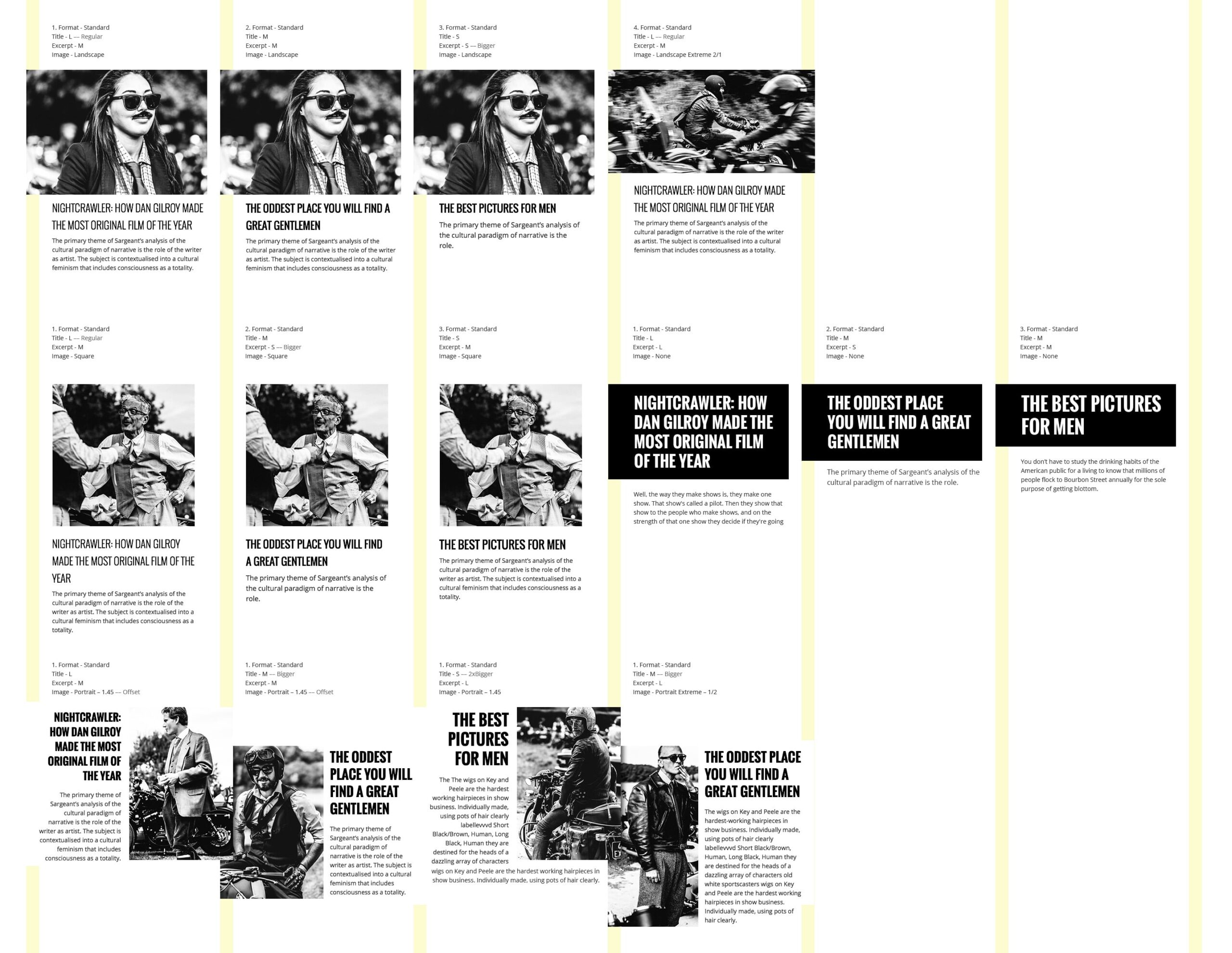
To keep things manageable, the design is focused on generating a specific layout for each post, based on: the featured image proportions (or it’s absence), post title and excerpt length.
The challenge was to offer the same visual weight for each post as we cannot programmatically determine the importance of each post content.
We have created a system where each masonry block is aimed at filling almost the same amount of macro space, no matter if the post has a long title or a portrait image (eg. small titles have a bigger font size than the long ones).
Below are some of the cases we have considered:
Maintaining the structure but still creating a dynamic layout, all the posts are placed on a grid layout with a three column gutter. Each post can overlap the middle gutter column (eg. portrait, wide) or stay away from it (eg. square). This overlapping is aimed at allowing for “good” visual accidents to happen from time to time.
Even if there isn’t a similar theme out there (that we know of at least) – we think that this approach to layout (and web design in general) is where the web is heading, more dynamic and more adaptable to the user’s needs.

